Web Analytics
Are you starting a new web project? Before you even start writing code or open Photoshop to create your designs, you need to think about the profitability of your site and define how you will convert a simple visitor into a customer. Conversions (purchases, calls, contact forms etc.) are the most important aspect of any web project. Not setting up a conversion strategy may therefore lower your return on investment or even cause your web project to fail.
It has been estimated that a person visits an average of 80 new web pages per month. You certainly don’t want your site to be just another one out of these 80 other web pages… So, we will list 3 key steps to increase your chances of converting your visitors into customers.
Step 1: Present yourself in under 5 seconds
These 5 seconds represent the average time you’re given to attract a visitor’s attention and convince them to search further. Given the number of badly presented and unrelated sites that show up on initial search results (thanks Google …), Internet users rapidly learn to sort out and leave sites as quickly as they found them.
In 5 seconds, your visitor can read roughly two lines of text as well as take a quick look at the context and layout of your content (images, logo etc.) in order to decide whether to stay or on your page or not.
So, you need to use those 5 seconds of their time to answer these two questions:
- Who are you?
- What do you do?
By answering these two questions, your visitors should be able to decide whether they want to stay on your page or if they are going to click on the red ‘x’ at the top right hand corner of their browser.
Let’s look at the following example to illustrate this point:
 .
.
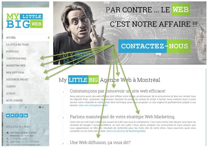
If you go to the My Little Big Web home page, you will see that the text content has been minimized so that it takes less than 5 seconds to find out who we are as well as the services we offer. The call to action statement (contact us) is also included in the first lines of text in order to invite visitors to inquire further.
The simple idea of presenting the content of your page clearly and concisely will allow you to increase your conversion rate for certain.
Step 2: Opt for a professional design
We must tell you right away: if you plan on saving money by opting for a basic website design, you are make a big mistake. For many potential customers, your website represents the only form of contact to know more about your offers and services. Even if you offer the best products of the planet, your visitors will not buy from your shop if the site layout/design isn’t inviting enough for them to stay.
The design of a website isn’t simply to make it “pretty”; it also allows you to convey other values that are very important to your customers: trust, professionalism, and seriousness.
Remember the 5 seconds we were talking about previously? Before even reading your content, your visitors are already judging whether they have landed on a serious website or not. All they need is a simple glance.
You’re doing tremendous work by perfecting your services, customer satisfaction and retention. This effort should also take into account the appearance of your website (which again is often the first contact your visitors have with your company).
Let’s look at another example of how important website design is in the final purchase decision:
.

.
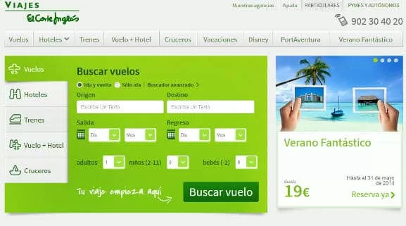
On this page the design is pretty basic. The colors are very vivid and it is difficult to know where to focus our attention. 6 different fonts are presented, the top menu is on two lines, the different shades of blue make reading difficult and the translation is far from perfect. A page like this can therefore stop many visitors from going further.
Step 3: show your visitors the way
Once your visitor has made the decision to stay on your page, you need to show them what to do. Your visitors have arrived on your site because they are already looking for an answer, so it is best to take them by the hand and simplify their visit as much as possible. If they want to learn more about your company, they will go and find what they need (your partners, your guarantees, your conditions, etc.). Do note that this is not a reason to neglect these pages.
Let’s look at another example:
.
In less than 5 seconds, it’s easy to see where we need to click in order to perform our search. We also find the call to action statement (Buscar vuelo) that encourages visitors to use the platform.
Do not forget that the less you ask from your visitors, the more they will give you. Simplicity coupled with a professional and attractive design should therefore be your priority. There’s no need to try to impress your visitors by displaying promotional banners or animations that flash all over the place. You may end up diverting their attention from the action you expect from them or overload them with too much content.
Do not hesitate to contact us at 514 572 7758 or via our contact form if you wish to speak with an expert who will answer all your questions.

Send a message
More reading